Color
The style guide provides to change stylistic for your design site.
Primary Color Palate
Shade
Black & White
00
#FFFFFF
100
#000000
Background Color
Basically neutral colors are used as supporting colors or secondary colors like backgrounds, text, etc.
800
#373D42
900 (Base)
#08090A
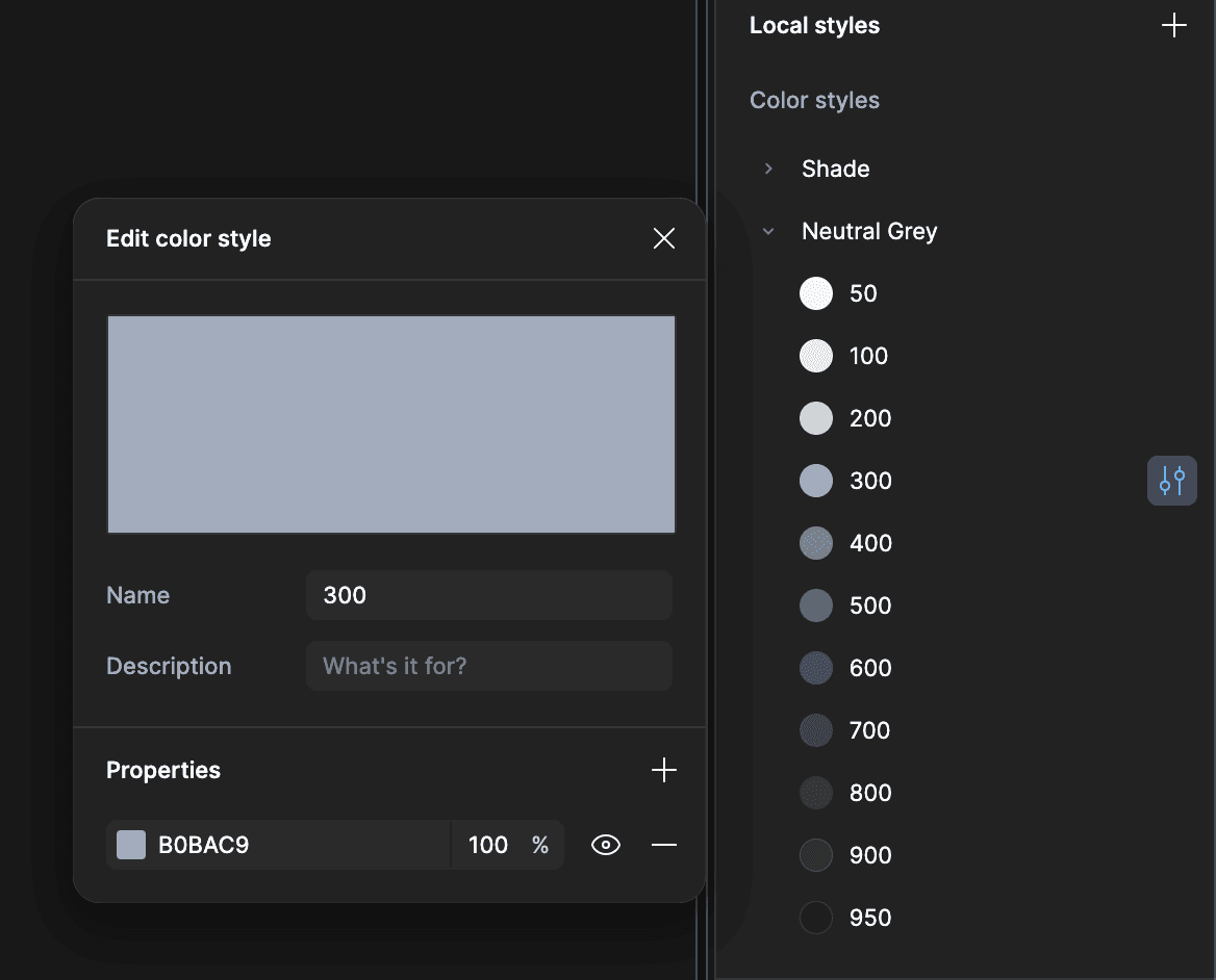
Neutral Grey
Basically neutral colors are used as supporting colors or secondary colors like backgrounds, text, etc.
50
#f6f7f9
100
#eceef2
200
#d5dbe2
300
#b0bac9
400
#8595ab
500
#667991
600
#516178
700
#424e62
800
#394353
900
#333b47
950
#22272f
Primary Color
Primary color palete is used for all interactive elements like CTA Button, Link, Inputs, Active Status, Etc
50
#eef2ff
100
#e0e7ff
200
#c7d2fe
300
#a5b4fc
400 (Base)
#7c87f7
500
#6467f0
600
#5047e4
700
#4439c9
800
#3831a2
900
#312e81
950
#1e1b4b
Success
This color palete carry on emotion of posibility. Generally it used for success, complete status, etc.
50
#F0FDF4
500
#23C55E
300
#87EEAC
Warning
This colorpalete carry the feelings of caution like warning status.
50
#FFFBEB
400
#FBBF23
300
#FCD34D
Destructive
This color palete carry on emotion of negativy like error status.
50
#FEF2F2
500
#EE4444
300
#FCA5A5
Gradient Color Palate
Gradient Color
This gradient uses linear or circular 2-color gradients for design accents
00
#FFFFFF
00
#FFFFFF
100
#000000
100
#000000
100
#000000
00
#FFFFFF
00
#FFFFFF
100
#000000
100
#000000
100
#000000
Modifying the colors
If anybody would like to modify and update the palte, here is how you can do so
1.
Fill - Change in Libraries

OR
2.
Local Style - Edit Color Styles